The Döner Club
Packaging for kebab brand
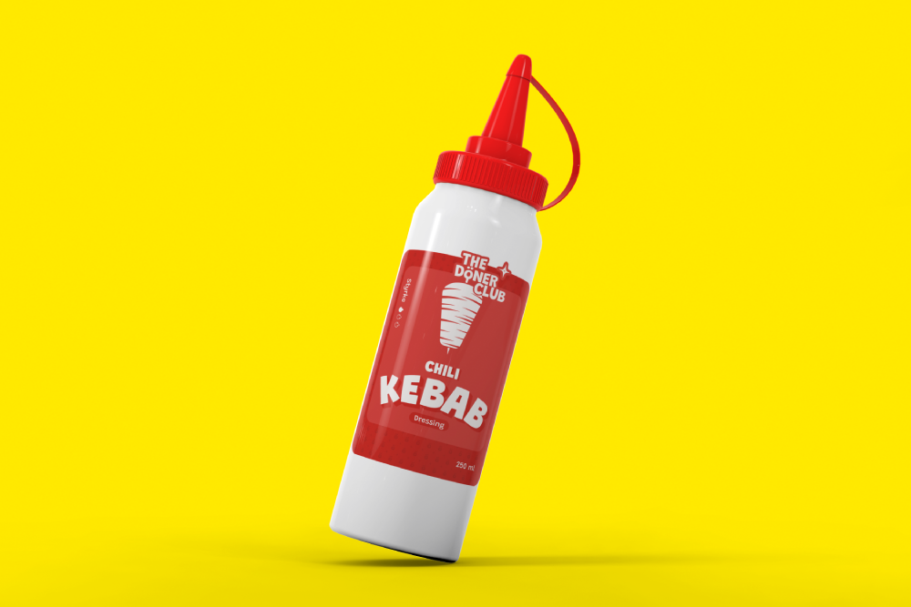
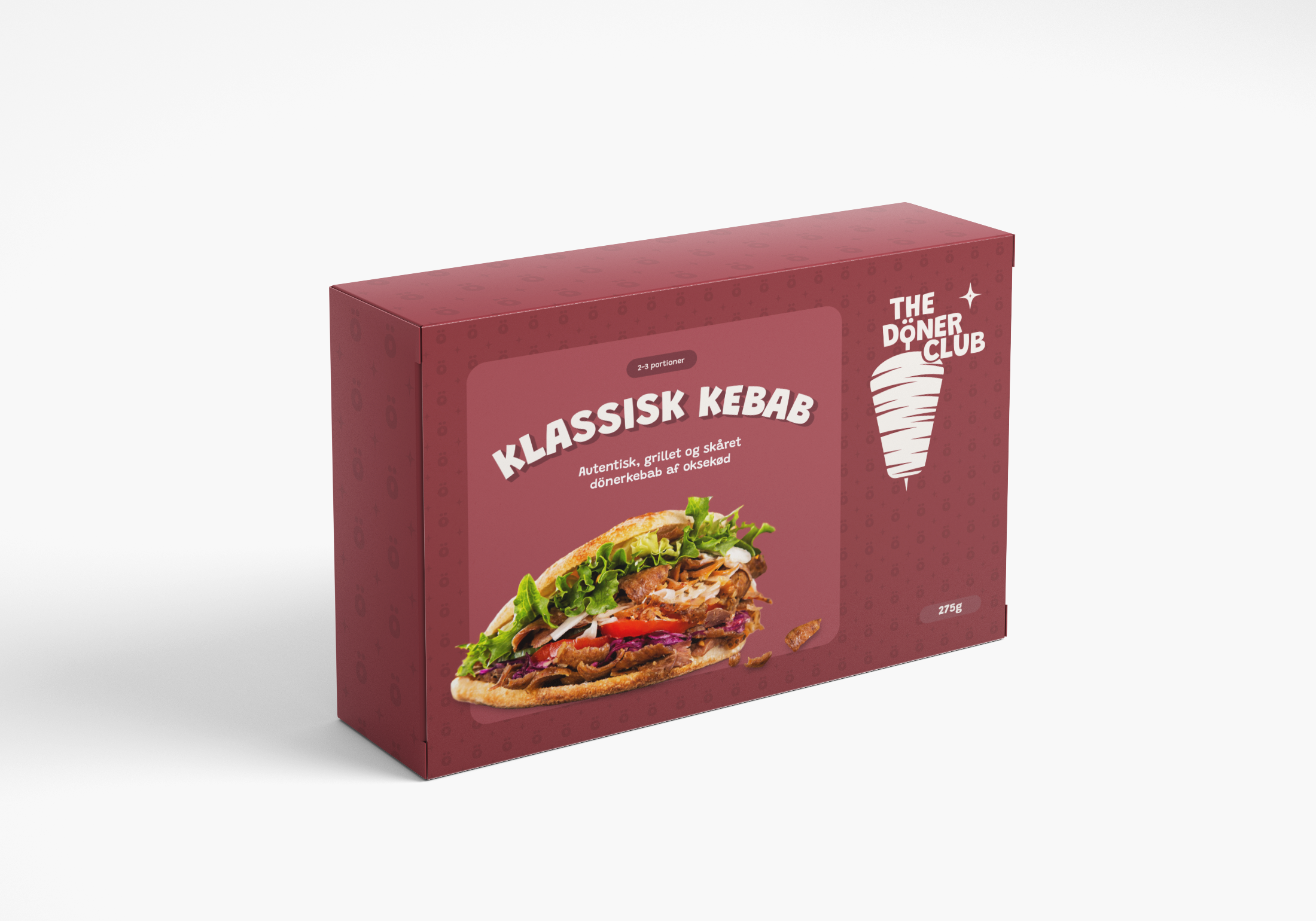
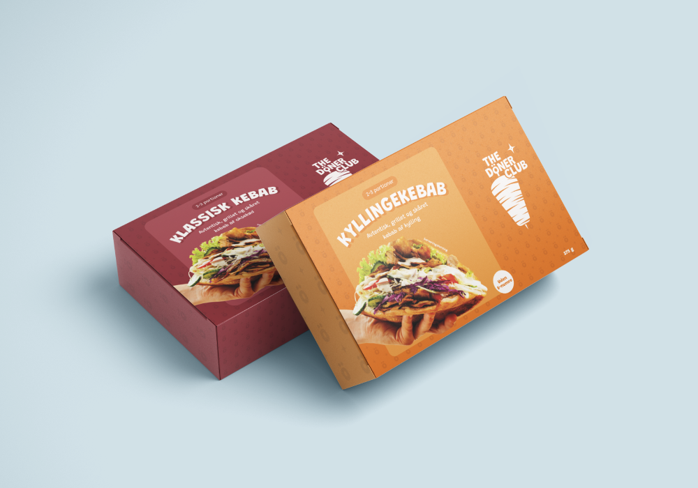
I designed the packaging for The Döner Club, a brand now available in supermarkets, with a strong focus on modernizing the perception of store-bought kebab. Central to the design was the stylized “Ö,” which became a distinctive brand symbol, reinforcing the product’s identity and adding a bold, contemporary edge. The visual language combined playful typography, dynamic layouts, and carefully chosen colors to create a packaging design that stands out on the shelves while maintaining a premium yet approachable feel. The result is a brand identity that redefines convenience food with style and authenticity.


